Case Study
Sugar Hoof
Visual Identity • Web Design • Packaging
Sugar Hoof had a strong product and a memorable name, but the brand needed a visual presence that felt as thoughtful as the treats themselves. With organic ingredients and a clear point of view, the opportunity was to create an identity that felt fresh, honest, and emotionally engaging without losing its natural simplicity.
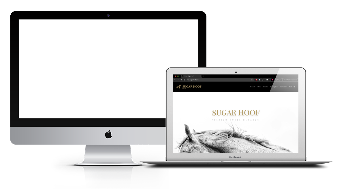
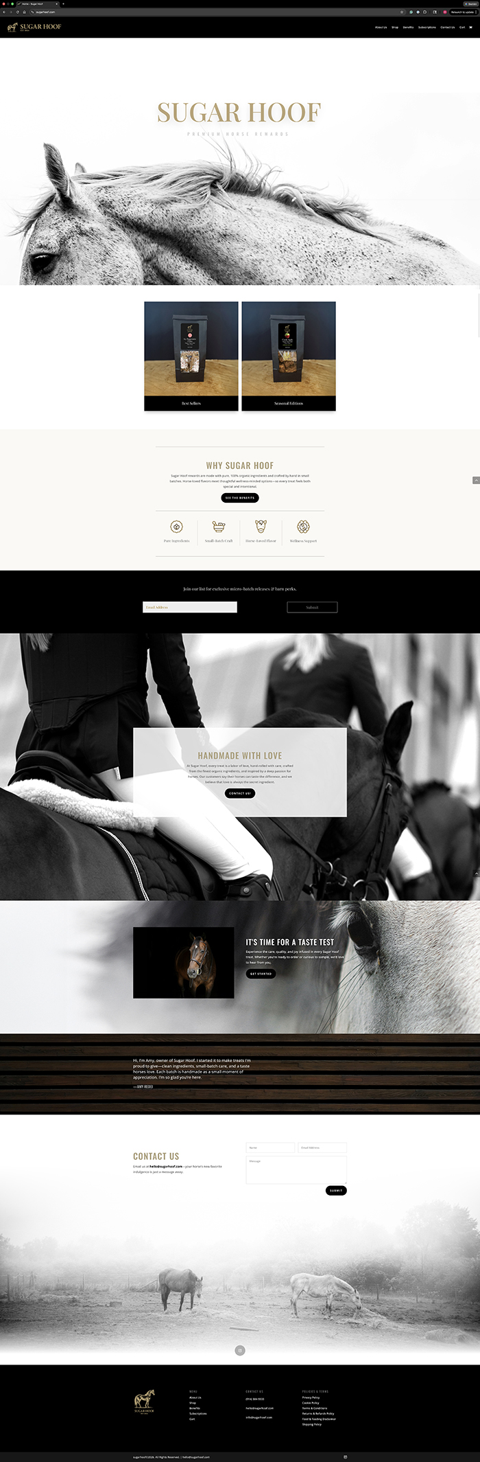
Blue Cup Design developed a warm, refined brand system through elegant typography, a clean palette, considered packaging, and a web presence designed to feel approachable and easy to trust. The photography added softness, luxury, and connection while staying true to the product’s honest, grounded ethos.
The result is a brand that feels clear, elevated, and memorable—speaking naturally to equestrians, animal lovers, and ethically minded consumers.