
Case Study
Rachel Cho Floral Design
Logot • Visual Identity • Environmental Branding • Promotional • Collateral
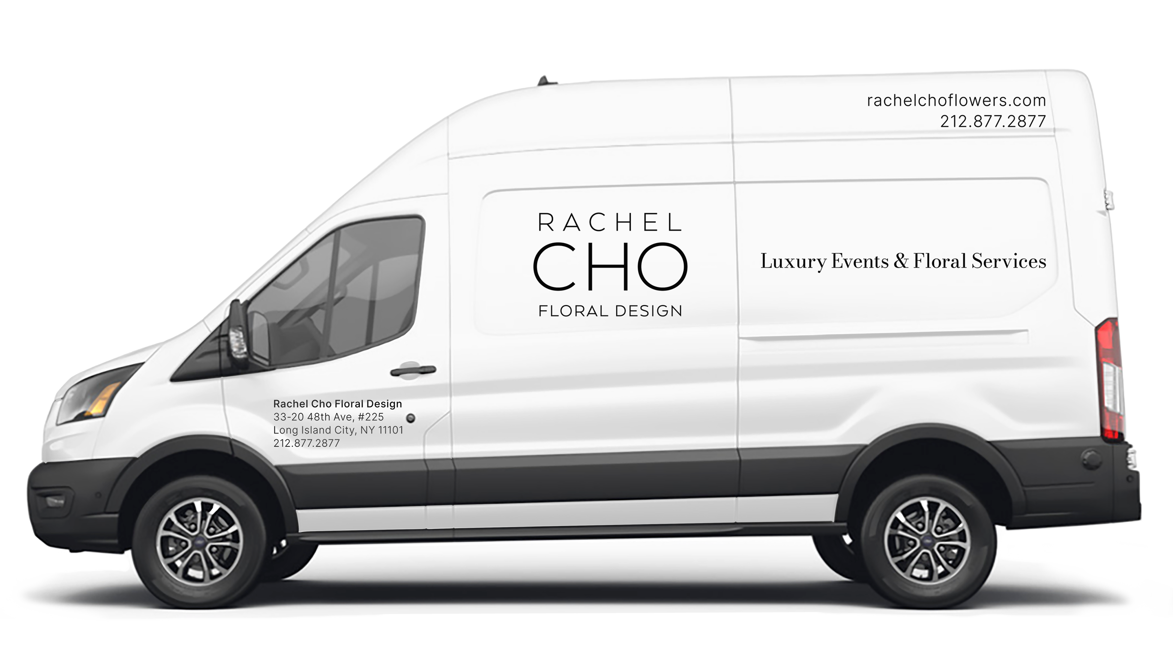
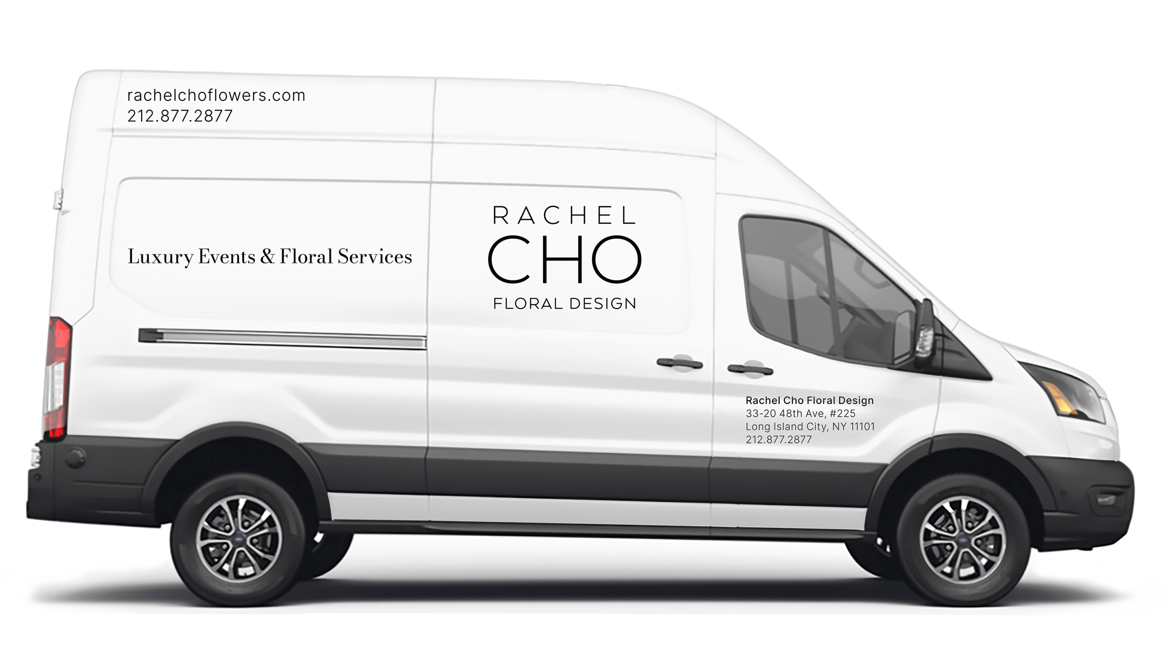
Our work for Rachel Cho Floral Design focused on timeless elegance and simplicity. Blue Cup Design refined the brand with a minimalist palette, black primary and taupe secondary, and paired sans-serif and serif fonts to support clarity and sophistication. The result is a refined, readable identity that allows the floral arrangements to shine, positioning the brand with understated modernity.
“
Wayne’s ability to bring a brand to life—visually and strategically—is remarkable. He helped us refine and elevate our identity with work that’s clean, polished, and purposeful. Always thoughtful, responsive, and collaborative, Wayne makes the creative process seamless and rewarding. We’re thrilled with the results and proud to partner with Blue Cup Design.
Peter Hein, Co-Owner & Chief Marketing Officer
”
Logotype