html { scroll-behavior: smooth; }

Earlier Work

Earlier, Not Elsewhere

This isn’t a retrospective. It’s a throughline, a glimpse into where we began, and the thinking that still shapes every move we make. At Blue Cup Design, every project starts with why. It’s how we uncover what matters, and build something that lasts.

Curiosity is our foundation. We’re a team of problem-solvers, driven to create brands that reveal, engage, and endure. What you see here isn’t just early work, it’s a reflection of the DNA that shows up in every touchpoint. The work evolves, but the intent? That stays.

Books

The Art of Tile

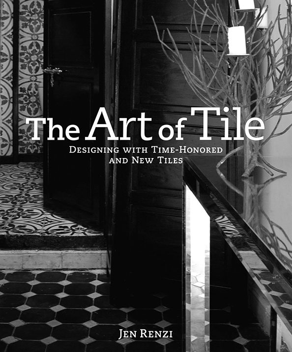
Part creative inspiration, part practical guide, The Art of the Tile demanded a design approach as refined and intentional as its subject. The layout is clean and editorial, allowing the intricate beauty of the tilework to take center stage. With a straightforward, approachable content structure, the book balances clarity and sophistication—mirroring the discipline and artistry behind tile itself. The result is a visual rhythm that honors pattern, repetition, and craftsmanship, making the design not just a frame for the content, but a reflection of it.
Publisher: Clarkson Potter / Publishers
By: Jen Renzi

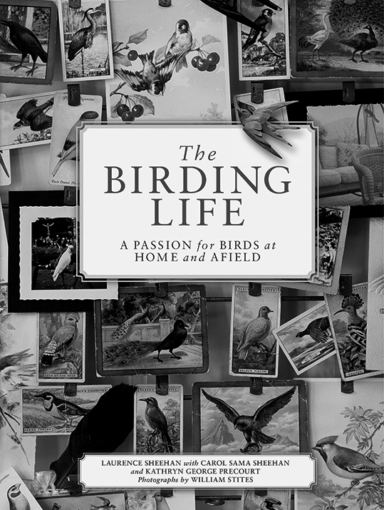
The Birding Life

The coffee table book, The Birding Life covers everything from the art of watching birds to collecting and incorporating the passion for birds in home interiors. The overall design is elegant and reserved. A classic grid brings a sense of continuity and organization as the visuals throughout are from multiple photographers. The blue used for typographic gestures was based on a robin’s egg. The serif type fonts, visual pacing, design and color palette are harmonious with the subject matter.
Publisher: Clarkson Potter / Publishers
Text by: Laurence Sheehan with Carol Sama Sheeehan and Kathryn George Precourt
Photography: William Stites

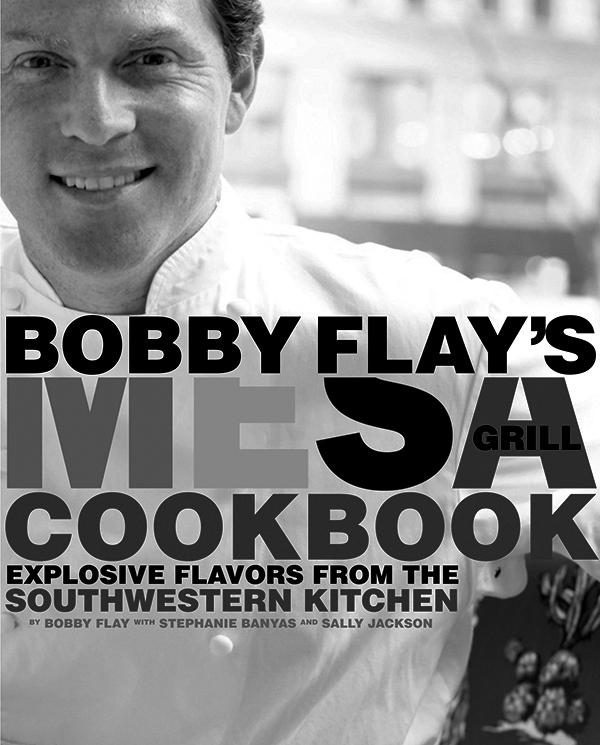
Bobby Flay’s Mesa Grill

Bobby Flay’s Mesa Grill was designed to channel the bold attitude and vibrant flavors of the restaurant. Oversized sans-serif headlines and grounded slab-serif body copy create a confident, punchy rhythm. The chili pepper–inspired palette adds heat, while straightforward, high-impact food photography takes center stage. Layered with interior shots and close-up restaurant details, the design offers a full-sensory taste of place—flavor, fire, and all.
Publisher: Clarkson Potter / Publishers
By: Bobby Flay with Stephanie Banyas and Sally Jackson

Enviro Branding

Westchester Table Tennis

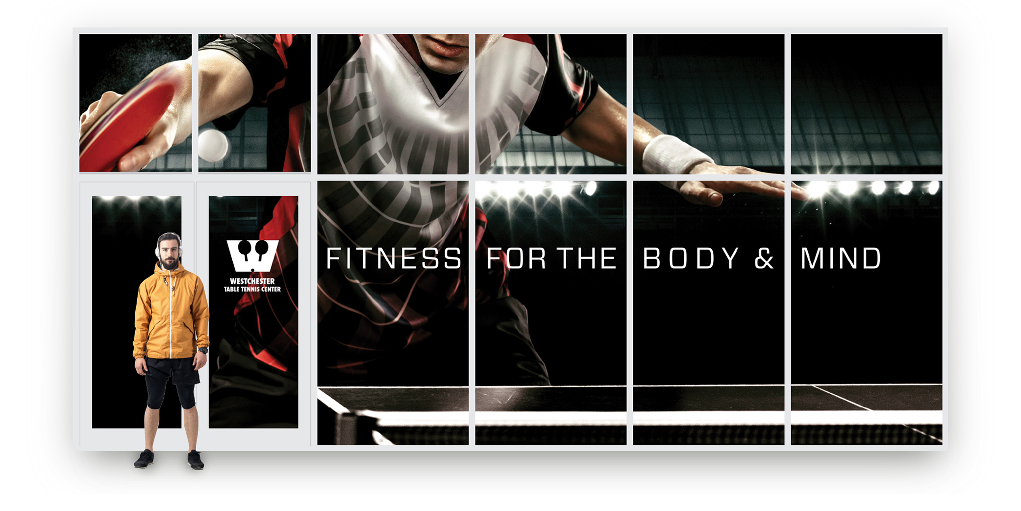
Blue Cup Design transformed the front windows of Westchester Table Tennis into a 30-foot visual statement, clear vinyl over Dusted Crystal creates a bold, opaque graphic from outside, while preserving outward visibility and diffusing light for an inviting interior experience.
Advertising

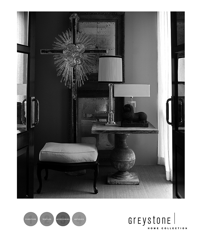
Greystone Home Collection

There’s a rhythm to Greystone, an understated luxury expressed through texture, light, and form. Blue Cup Design shaped an identity that listens as much as it leads, letting the interiors speak with quiet confidence. Every element, typography, photography, and pacing, is woven with intention, creating a brand presence that feels effortless, refined, and wholly aligned from the first glance to the final detail.

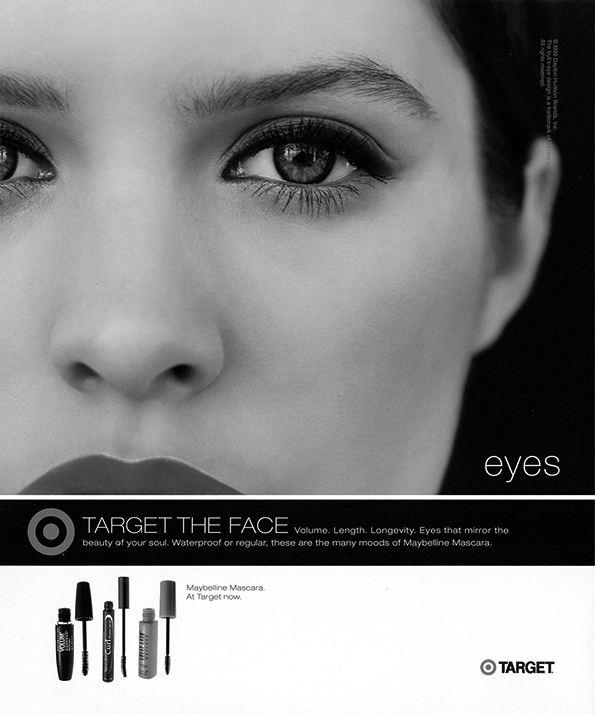
Target

Developed by Blue Cup Design, the precedent-setting “Target the Face, Lips, and Eyes” campaign marked the first time Target’s iconic bullseye appeared independently from its wordmark—a bold move in mass retail branding. Using “target” as a playful double-entendre across eyes, lips, and nails, the campaign embraced high-style editorial energy while staying accessible. The result was a confident, visually arresting launch celebrating individuality, self-expression, and the power of minimal branding.

H. Brooks & Company

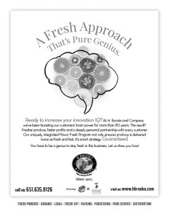
For H. Brooks & Company, Blue Cup Design captured the brand’s immediacy, humor, and fresh-first mindset. We sourced honest, no-frills imagery, then overlaid each with hand-sketched pencil drawings, like spotting shapes in clouds, to evoke whimsy with purpose. From logo to packaging to sales kits, the work reflected a straight-from-the-source attitude and showcased our offbeat, intuitive approach to bringing brand stories to life.

Enviro Branding

Greystone Home Collection

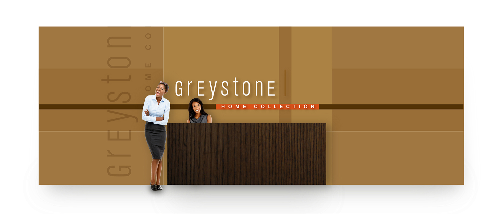
A seamless extension of the Greystone brand, this showroom wall embodies quiet elegance and spatial clarity. Designed by Blue Cup Design, its layered geometry, warm palette, and restrained typography reflect a refined visual language—one that feels both rooted and elevated, fully aligned with the character of the collection itself.
Magazines

Aspen Magazine

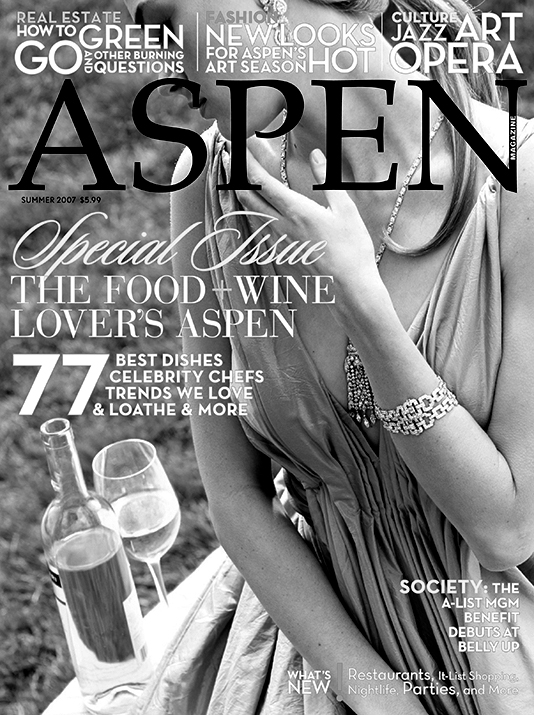
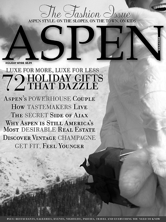
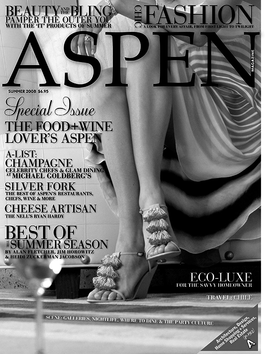
Redesigned by Blue Cup Design, Aspen Magazine was transformed into a refined, fashion-forward publication rooted in place. Balancing alpine authenticity with urban sophistication, the new aesthetic elevated local culture, pairing Aspen’s culinary and community spirit with editorial polish worthy of New York or L.A., and luxe features from Gucci to Prada.

(Summer)

(Winter)

(Summer)